When thinking about your product label design color should be a big part of your decision making. Different colors make different impressions on people and can convey completely different emotions and desires. When thinking about the feeling you want your product to convey, the color should be one of the most important things you consider.
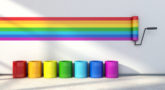
There are many studies that prove that certain colors evoke certain emotions in people. In general, brighter shades convey energy and command attention, while darker hues are relaxing and calming. Picking the right or wrong color can impact product sales and sway a customer into deciding if a product is right for them or not. Your whole color-scheme is important for your business, everything must match, from the label to your magazine design, you can always go on sites such as Printivity to help you with this, and get it exactly how you want it. Here is a rundown of some of the basic colors so that you can choose the best one to use in your product label design.
Red: This is a color associated with ferocity, power, and importance. It is also used in “Sale” signs and commands attention. Red is a dominant color that draws attention and will get your product noticed. You need to make sure it is appropriate for your product because it is such a strong color. For example, red wouldn’t be a good choice for a soothing eye mask, but it would be good for an energy drink.
Yellow: This happy color is associated with a broad spectrum of things such as happiness and friendliness, but it is also linked to warning signs and can activate anxiety in people. It is definitely a stimulating color that attracts attention. The hue of yellow that you choose is very important because a soft yellow can convey lighthearted happiness, while a harsh yellow would be appropriate for an industrial product.
Green: Serene green conveys nature, growth, and wealth. It is a soothing color that is associated with the environment and things that are all-natural and organic. It is also the color most associated with wealth and prosperity. Green is a very balanced color choice for a natural product. There are plenty of different shades of green, so picking the one that best fits your product is important.
Blue: This is the color of trust, which makes it a good color to pick for a product label design. It is also inviting, which might entice more people to pick up the product off of the shelf. One of the best things about blue is its versatility. Shades range from light blue – which is associated with water and the sky to dark, royal blue – which suggests trust and longevity.
When picking your colors, take everything into consideration. For example, different colors are associated with masculine and feminine energy. Others may be associated with youth and fun, while others convey a more serious tone. Always be conscious of the product you are selling when choosing the colors in your product label design.